PROJECT GOALS:
To create a mobile app to help users organize their meal planning, recipe gathering, and grocery shopping experiences for convenience and ease.
MY ROLE & RESPONSIBILITIES: UX/ UI designer (Group Project). Almost every task was collaborative. There were times when we split up and worked somewhat independently but these were typically individual tasks that were split up equally between all team members.
MOBILE PROTOTYPE: “EZgroceries”
TOOLS: Miro, InVision, Google Drive.
TIME LINE: 4 weeks.
RESEARCH QUESTION:
How can we help users have an easier and quicker way to meal-plan, with accordance to their needs?
RESEARCH OBJECTIVES:
For our interview plan we wanted to learn more about the users experience with grocery shopping, meal planning, and budgeting. We agreed that these questions help us understand who are users are, and their needs. This also helped us understand what kind of features might benefit them down the road.
INTERVIEW PLAN
As a group we interviewed six people who participated in a qualitative interview and survey of 13 potential users. The interviews helped us better understand who our users are and their needs.
Our interviews showed us that many of our users want to live a healthy lifestyle, and enjoy cooking, but have limited time and resources to do so. Our users also experience having a hard time finding recipes that fit their budgets and needs.
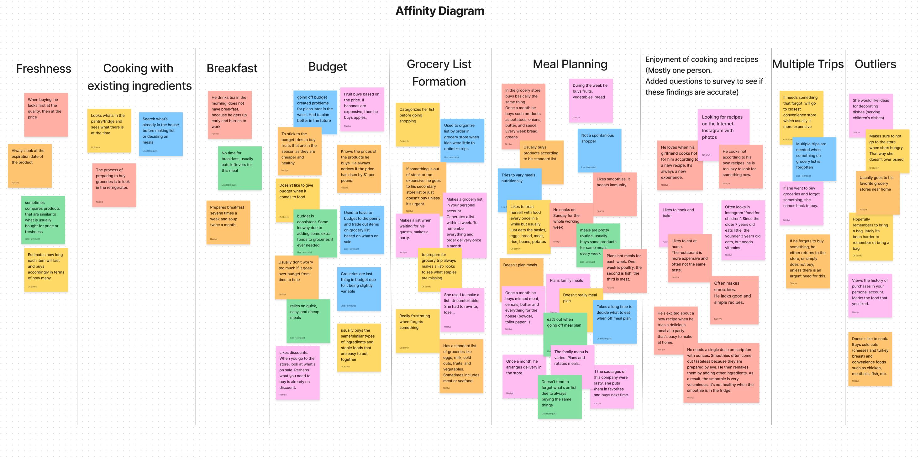
AFFINITY DIAGRAM
The categories were:
USER PERSONA
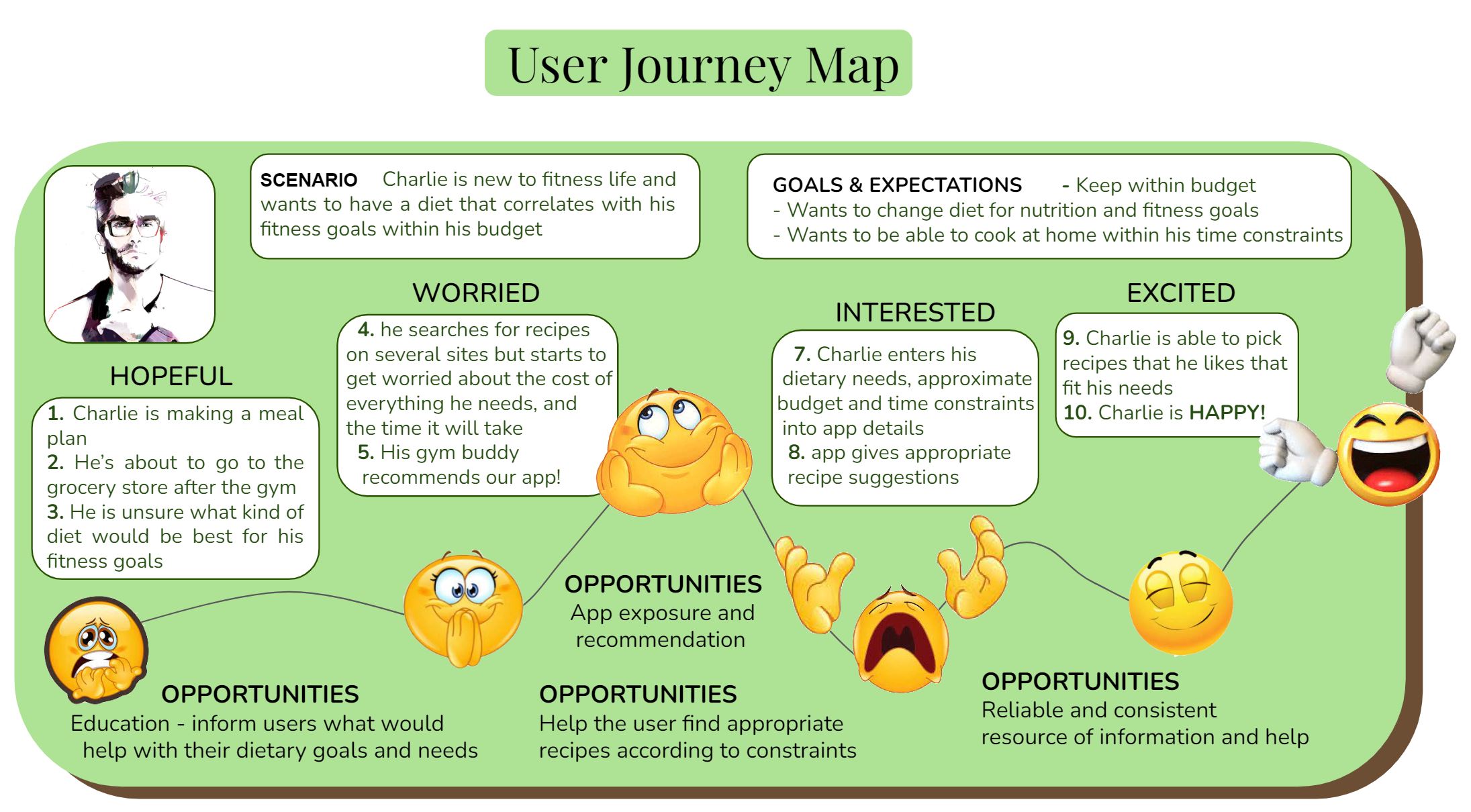
A user person is a middle-aged man who lives in a big city and is busy with his career. He loves to cook and has to keep a diet.
USER INSIGHT
People who experience constraints such as diet, budget, time, and cooking knowledge need assistance with quick meal planning that fit their constraints in nutrition and in their budget.
Our goal is to help users plan their daily meals, find solutions for people with food restrictions, as well as save time in shopping planning and organizing their favorite recipes. So they don’t forget anything amid everyday worries, have all the necessary information at hand, don’t forget to eat, buy the necessary ingredient and know how much money they spend on food.
We brainstormed with the team (I like... I wish... I wonder...) and came up with a Feature Prioritization Matrix.
We highlighted the most important features that need to be implemented. We made the simplest and fastest functions to implement first.
More complex, but no less significant features for attracting and retaining our users, we will implement after.
COMPETITORS:
After some research and analysis we found that our two biggest competitors are the Bring! and Paprika apps. Bring! primarily focuses on grocery lists and Paprika primarily focuses on recie saving and discovering. There is a lot of crossover between the two apps, however, and they are both designed incredibly well. Bring! is free while Paprika is a paid subscription service. We continued to reference the design ideas we saw in these apps to create something new and bring the best of both into our design ideation.
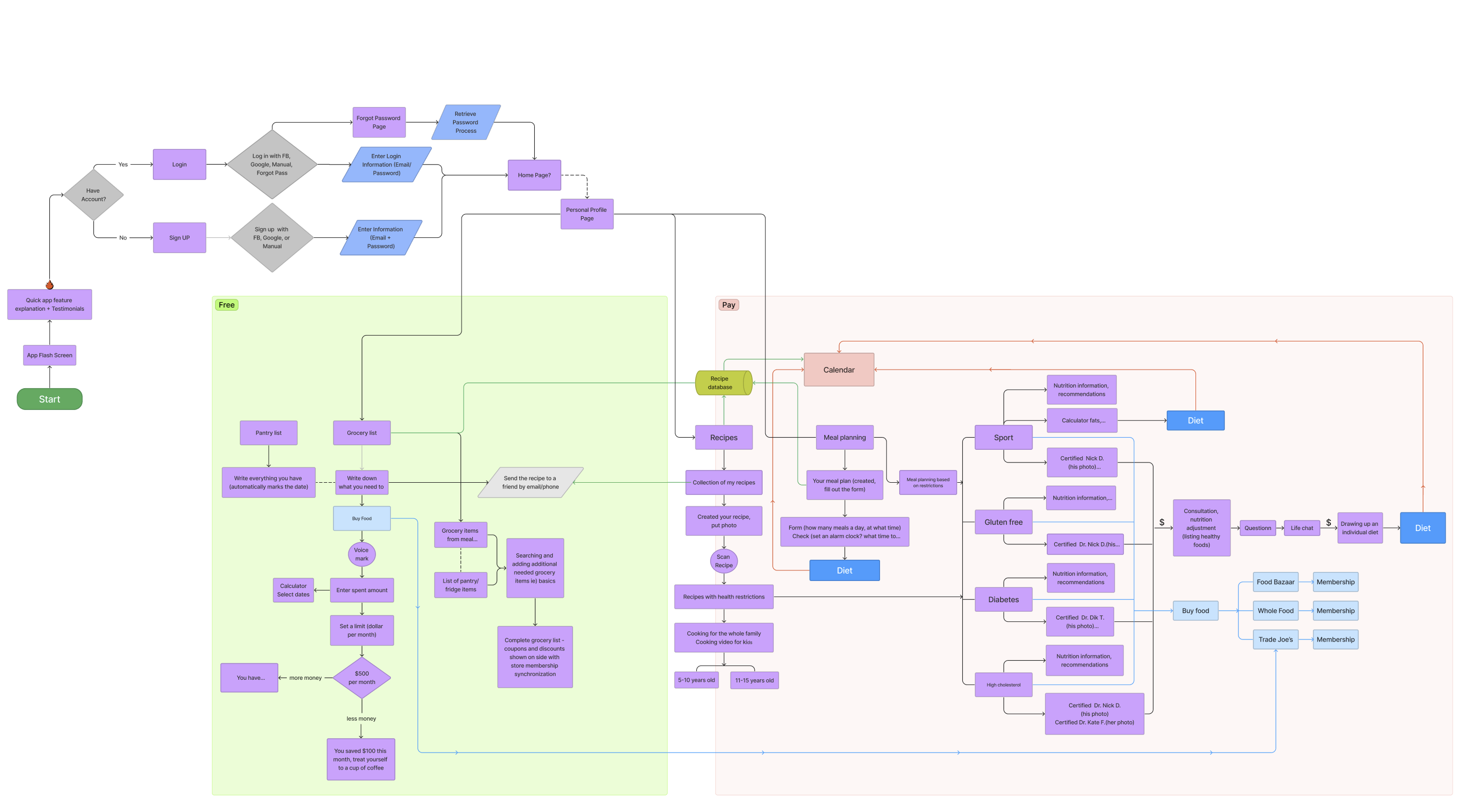
As a group, we identified the three red routes of our user flow idea and split the overall user flow task into three pieces accordingly.
These three pieces are as follows:
What we’ve learned...
We learned that sometimes we think we know what a user needs and wants but find, at the end of research, user needs are different than expected. Users often contradict themselves when describing experiences and needs.
Possible concerns for further testing...
We would like further testing and iterating to ensure user flow is intuitive.
Final thoughts...
We felt the experience of group collaboration was enlightening and taught us a lot about how to work in a team setting to create a successful app.
In details...